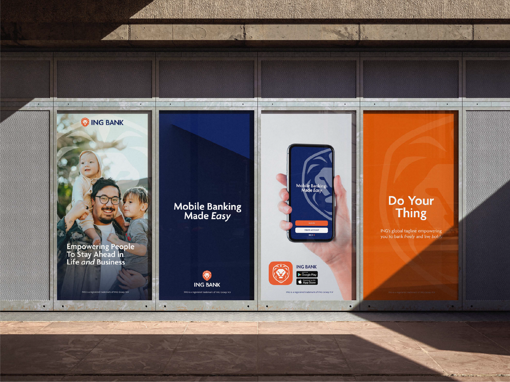
The previous ING logo, featuring an intricate lion illustration, lacked versatility across various multimedia platforms and did not scale well. The redesigned icon simplifies the lion into a modern, streamlined emblem, making it more adaptable for digital and print use. While maintaining ING’s traditional Dutch colors of white, blue, and orange, the updated design enhances brand recognition, appeals to a younger audience, and supports the company’s transition into a primarily online banking experience.